A carousel post is a single social media post made up of multiple images, videos, or slides that the viewer swipes through one at a time, used to tell a longer story, walk through a how-to, or show several angles of the same idea inside one feed unit.
What is a carousel post?
A carousel post takes one post slot in the feed and uses it to hold a small stack of slides, usually somewhere between two and twenty. The first slide is what stops the scroll, the rest of the slides are what the viewer swipes through if the first one earns the attention. Instagram introduced the format in 2017, LinkedIn, Facebook, TikTok, and Pinterest each added their own version, and by 2026 the carousel is one of the most reliable engagement formats across every major platform.
The reason marketers and creators reach for the format is that the carousel does two jobs at once. It packs more value into one feed slot than a single image can, and it earns a second look from the ranking system. Swiping counts as engagement on Instagram and LinkedIn, so a carousel that gets four or five swipes per viewer sends a much stronger signal than a single image that gets a glance and a scroll past.
There is also a quiet mechanical advantage. Instagram in particular will sometimes re-show a missed carousel with the second slide on top instead of the first, which gives the same post a second moment in the feed. That second-chance behaviour is part of why carousels keep showing up in the average-engagement league tables ahead of single images and, on some accounts, ahead of Reels.
How do carousel posts work on each platform?
The format is the same idea everywhere, the limits and the mechanics are not. Treating Instagram and LinkedIn as if they behave the same way is one of the more common reasons a strong carousel idea underperforms on one network and lands on the other.
Up to twenty slides per post, mixing images and videos freely. All slides are locked to the aspect ratio you pick for slide one, which is usually 1:1 (1080 by 1080 pixels) or 4:5 portrait (1080 by 1350 pixels). The reference is Instagram's help on sharing a post with multiple photos or videos. You can rearrange and remove slides after publishing, you cannot add a new slide.
Native LinkedIn carousels were retired at the end of 2023. The current way to publish a carousel on LinkedIn is the document post: export your slides as a PDF (up to 300 pages, though almost no one goes beyond 10 to 15) and upload it to the post composer. The PDF renders as a swipeable carousel in the feed. Paid carousel ads are a separate product inside LinkedIn Campaign Manager, with up to 10 cards per ad, covered in LinkedIn's carousel ads overview.
Organic Facebook carousel posts allow up to ten slides, each one an image or a short video, with a link and a short caption per card on link-style carousels. The paid version is the Meta carousel ad, documented in Meta Business Help on carousel ads. Most brands use the carousel format on Facebook in the ad system rather than the organic feed.
TikTok
TikTok photo mode lets you upload up to 35 still images into one post, which the app plays as a slideshow that viewers can also tap through manually. Caption, music, and effects work the same way as on a video post. TikTok photo posts are easy to overlook, they are also an under-used route into the For You feed for accounts that struggle to film video consistently.
Pinterest carousel Pins hold up to five images in one Pin. All five share a title, description, and destination link, which makes the format better for showing the same product from different angles or steps of one idea than for telling five separate stories. Carousel Pins behave the same in search results as standard Pins.
X (formerly Twitter)
X does not have a true carousel post in the organic feed, the closest equivalent is attaching up to four images or one video to a single post. Paid carousel-style ads exist inside X Ads as a multi-destination card, with separate creative per card.
A practical note for schedulers and publishing tools. Several third-party APIs cap Instagram carousels at ten slides even though the native app allows twenty, because the official Instagram Graph API limit for container-based carousel uploads is ten. If you write a twenty-slide carousel in a third-party tool and the post lands as ten, that is why.
What is the difference between a carousel post and a carousel ad?
The format is shared, the rest is not. A carousel post is an organic post in the feed. A carousel ad is paid distribution through Meta Ads Manager, LinkedIn Campaign Manager, or the platform's native ads tool, with full targeting and conversion tracking.
Carousel post
An organic post on the public profile or page, published once, distributed by the platform's ranking system to followers first and a wider audience as engagement builds. No targeting, no spend, no conversion tracking. Easy to publish, the ceiling on reach is whatever the algorithm decides.
Carousel ad
A paid placement that uses the same swipeable cards but runs through the ad system. You pick the audience, the placements (feed, Stories, Reels, search, side rail on LinkedIn), the budget, the bid strategy, and the conversion event. Each card can have its own headline, description, destination URL, and CTA, which is the pattern Meta documents in Meta's carousel ads help.
Boosted carousel post
The hybrid: take a strong organic carousel post and pay to put it in front of more people from the post itself or from Meta Business Suite. Fewer targeting and creative controls than a full carousel ad, faster to set up, useful when an organic post has already proven the idea. The wider mechanics of boosting are in the boosted post entry.
The simple rule, as a rough first pass: organic carousel for storytelling and awareness, carousel ad for performance, boost when the organic version already worked and you want to amplify it.
How do you make a strong carousel post?
Most strong carousels follow the same shape. The format is forgiving in one way (the swipe gives you a second and third attempt at the viewer) and unforgiving in another (a weak first slide means none of the others ever get seen).
- Earn the swipe on slide one. Treat the first slide as the hook, the same way the first line of a caption earns the second line. A sharp claim, a surprising number, a before-and-after teaser, a clear promise of what the next slides deliver.
- One idea per slide. Carousels that try to cram three thoughts onto every slide turn into a wall of text on a phone screen. Pick one idea, give it room to breathe, let the swipe do the work of transition.
- Build a consistent visual system. Same aspect ratio, same colour palette, same typography, same spacing. The carousel reads as a single object, and visual inconsistency between slides feels jarring even when each slide looks fine on its own.
- Pace the story. A useful carousel shape is hook, set-up, three to five payoff slides, a summary, and a clear final action. Five to seven slides is the practical sweet spot, ten when the topic truly needs it.
- Land the final slide. The last slide does two jobs: it summarises what the carousel was about, and it tells the viewer what to do next. Save this for later, share it with someone who needs it, tap the link in bio, follow for more on this topic. One ask, not three.
- Write alt text per slide. Instagram and LinkedIn both let you add alt text to each image. It is the single biggest accessibility win on the format and almost nobody does it.
- Pair the carousel with a real caption.A carousel does not let the post caption off the hook. The caption still gives the post topic context for the ranking system, still helps the right audience find the post in search, and still carries the brand voice. A 3,000-character carousel paired with the caption "new post" gets a fraction of the reach the same carousel earns with a written caption that names the topic.
Carousels also benefit from being designed alongside the caption rather than after it. Writing the slides and the caption in the same batched session keeps the hook, the slide order, and the closing CTA pulling in the same direction.
What do good carousel posts look like?
The strongest carousels tend to belong to one of a small number of shapes. Most accounts find a couple that fit the brand voice and run them as repeatable formats.

Slide 1 — Cover
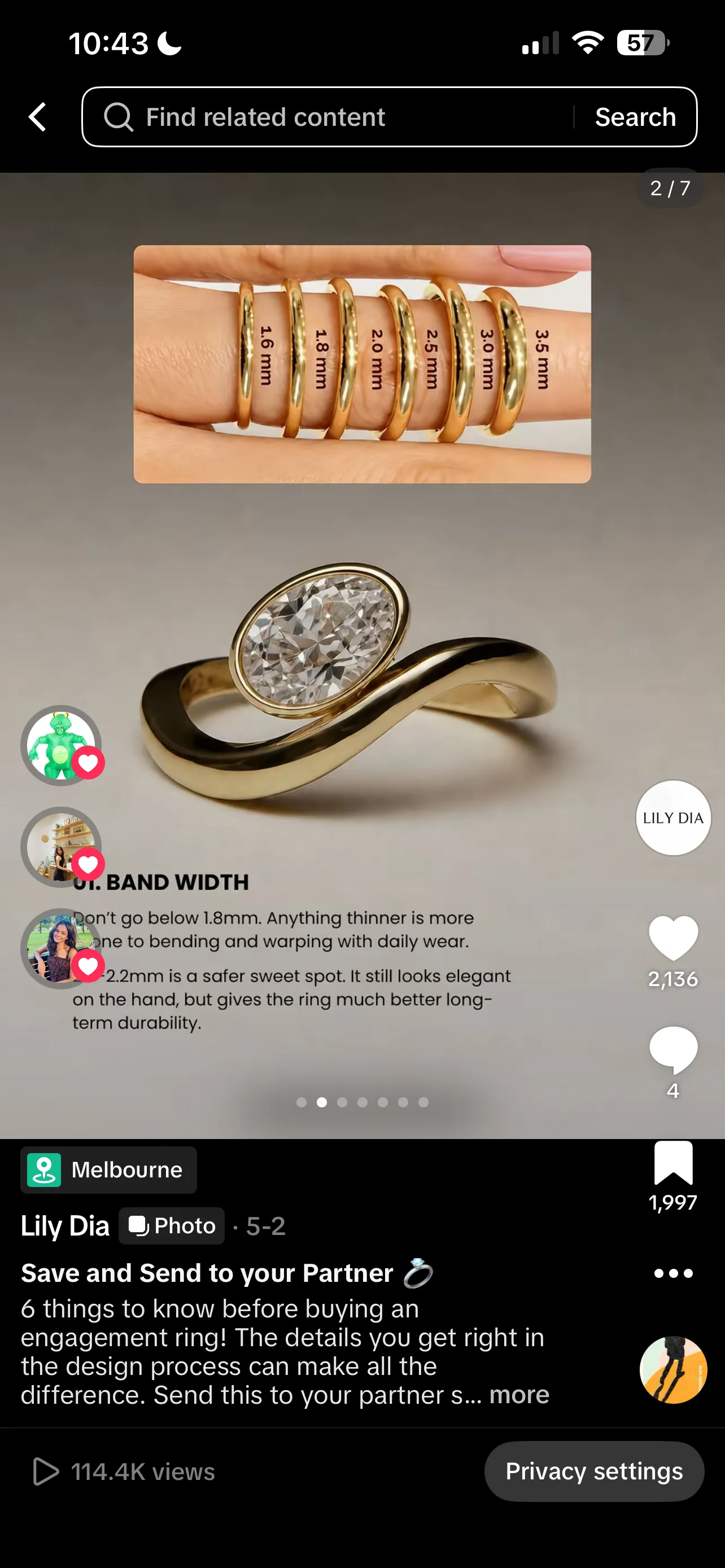
Slide 2 — Band width
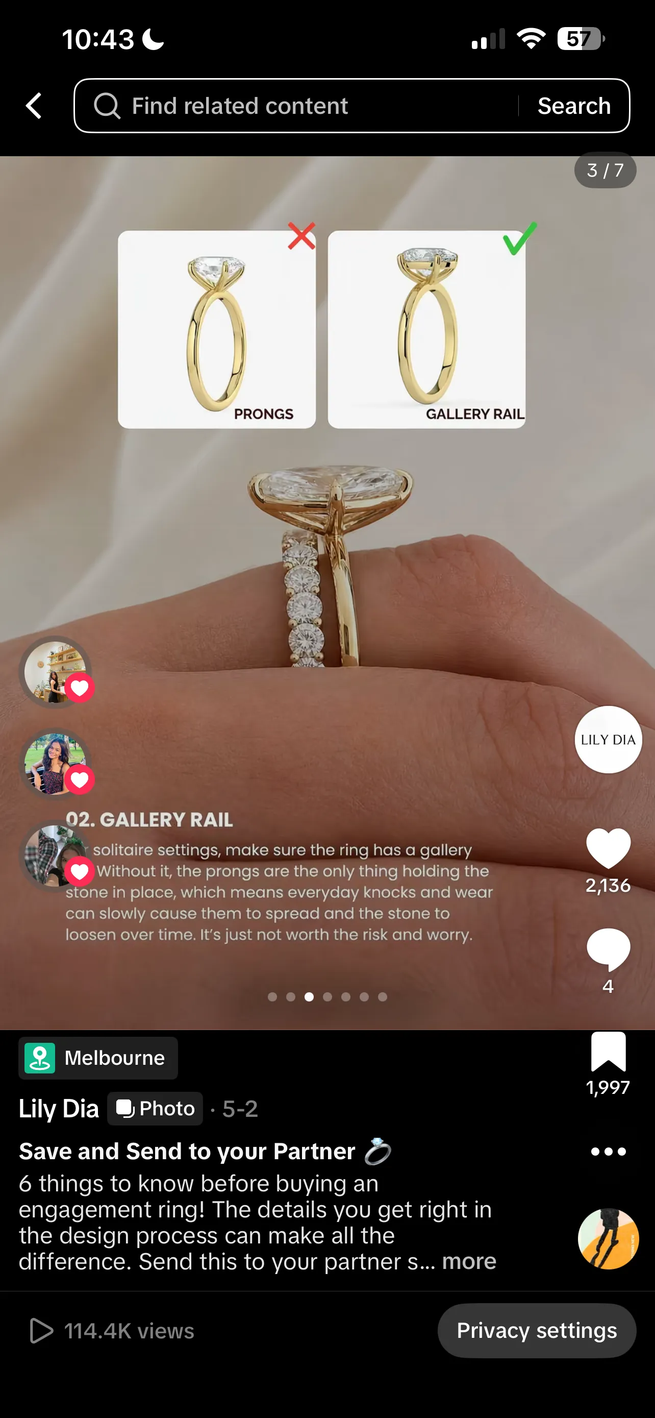
Slide 3 — Gallery rail
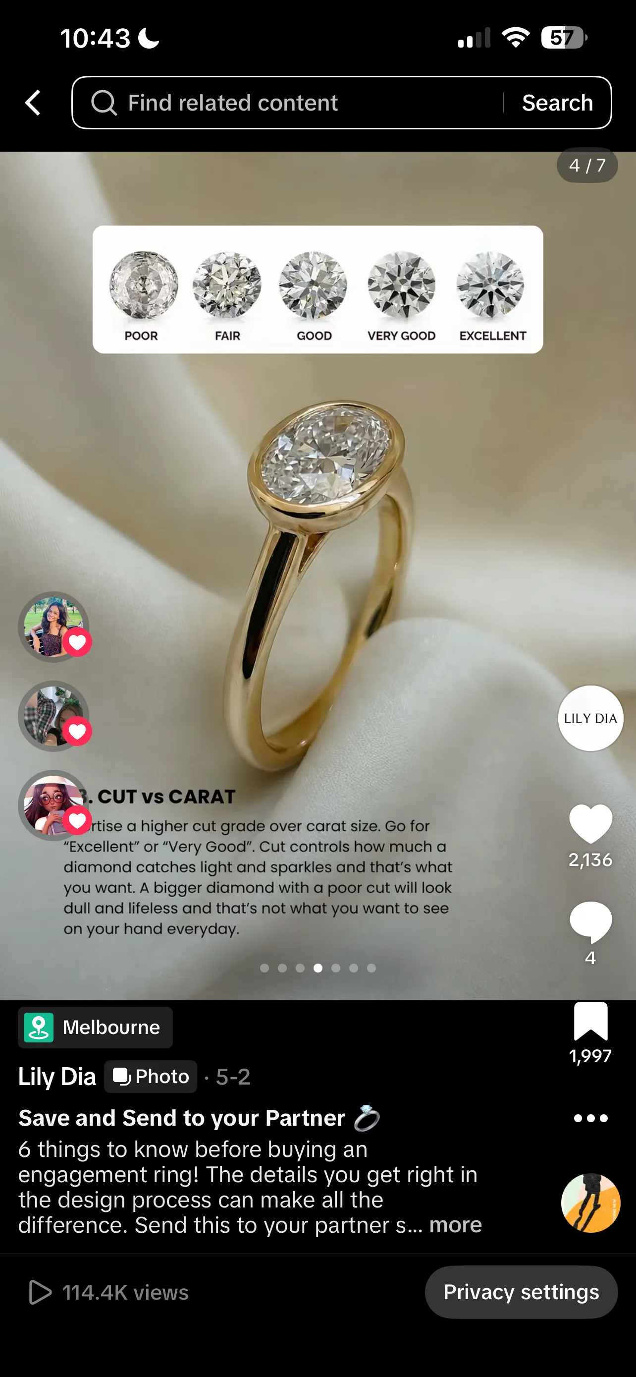
Slide 4 — Cut vs carat
Educational how-to (Instagram or LinkedIn)
Slide one is the promise (how to do X in five steps). Slides two to six are the steps, one per slide. Slide seven is a recap and a save-this-for-later CTA. This is the format the LinkedIn algorithm rewards most consistently in 2026, and it is also the carousel shape most likely to earn long-tail saves on Instagram.
Listicle (any platform)
Hook with the count and the payoff (seven mistakes that quietly kill conversion). One item per slide. A short summary slide at the end. Listicles play well to the swipe behaviour because each slide is its own little reward.
Storytelling (Instagram or LinkedIn document)
Hook with the scene or the turning point. Spend four to six slides walking through the story, one beat at a time. Land on the lesson or the takeaway. Story carousels tend to outperform single-image storytelling posts because the slow swipe rhythm matches the pacing of a real story.
Product showcase (Instagram, Facebook, Pinterest)
Hero shot on slide one. Detail shots, on-body or in-context shots, and a final slide with price, link, and a clear CTA. This is what the carousel format was originally designed for and it still works.
Before and after (Instagram or TikTok photo mode)
Slide one is the before. Slide two is the after. Slides three to five fill in the how. Five slides is enough, ten is too many. The contrast between the first and second slide is what earns the swipe past slide two.
Data and insight (LinkedIn document)
Hook with the headline number. Spend the next slides unpacking the data with charts, callouts, and short bursts of context. Close with a clear takeaway and a CTA to the longer report or article. Document carousels are the LinkedIn-native way to ship a report summary.
Repeatable shapes are also how you build pattern recognition for the audience. After a few carousels in the same shape, followers start to know what they are getting when they swipe, which lifts both swipe rate and saves on the format.
What mistakes should you avoid with carousel posts?
Most carousel mistakes show up in the first slide, the slide count, or the lack of a final ask. Get those three right and the rest of the carousel can be ordinary and still work.
A weak first slide
If slide one does not earn the swipe, the other slides do not exist. Generic title cards, brand-only intros, and decorative covers are the most common reason a carousel quietly dies. Put the strongest hook on slide one, even if it feels like it belongs in the middle.
Too many slides
A fifteen-slide carousel that should have been six padded with filler reads as filler. The platform rewards swipes that actually finish, not slides that pile up. If you cannot say what each slide is doing, that slide does not need to be there.
Mismatched aspect ratios
Carousels lock every slide to whatever ratio the first slide uses. Mixing portrait and landscape designs into one carousel leaves slides cropped or letterboxed in ways the design did not account for. Pick one ratio, design every slide to fit it.
No final CTA
A carousel without a closing slide leaves the viewer at the end with nowhere to go. Save this, share, link in bio, follow for more. The last slide is the cheapest place to add a conversion moment to a piece of content you already made, and it doubles as a signal the algorithm reads as completion.
Treating the caption as optional
A strong carousel without a real caption is a half-finished post. The caption is where the topic context lives for the ranking system, where the post earns long-tail reach in search, and where the brand voice survives once the post leaves the original feed.
Forgetting alt text
Instagram and LinkedIn both support per-slide alt text. Skipping it locks screen-reader users out of the content and skips a small SEO and search-discovery benefit on Instagram. Five lines of alt text per slide is not a lot of work for the win.
Cross-posting without re-cropping
A 4:5 Instagram carousel pasted into a TikTok photo post or a LinkedIn document gets cropped, scaled, or padded in ways the original design did not account for. Re-export the slides for the destination platform when the carousel is worth running on more than one.
Carousel post FAQ
How many slides should a carousel post have?
Five to seven slides is the practical sweet spot on Instagram and LinkedIn. That is long enough to tell a real story, short enough that the audience finishes the swipe, and well inside the platform limits. You can go to ten or beyond when the topic genuinely needs it, but more slides do not automatically mean more engagement, and a thin carousel padded out to fifteen reads as filler.
Can you edit a carousel post after publishing?
On Instagram you can rearrange slides and remove a slide from a published carousel, you cannot add a new slide. The caption is editable after posting on most platforms. On LinkedIn, a published document post cannot be edited slide by slide, you have to delete and re-share. On TikTok, the photo mode post is fixed once it is up.
Why do carousel posts get more engagement?
Two reasons. The first is that Instagram and LinkedIn will sometimes re-show the carousel with the second slide on top if a viewer scrolled past the first one, which gives the same post a second chance in the feed. The second is that swiping itself counts as engagement on most ranking systems, so a carousel that earns three or four swipes per viewer sends a much stronger signal than a single image that gets a glance.
What size should carousel images be?
Square (1080 by 1080 pixels) or portrait (1080 by 1350 pixels) for Instagram and Facebook, landscape (1080 by 566 pixels) when the design is wider than tall. Pick one ratio for the whole carousel and use it on every slide, because the first slide locks the ratio for the rest. LinkedIn document carousels live inside a PDF, so they end up at whatever page size you exported, usually portrait or square at 1080 to 1200 pixels wide.
Are LinkedIn carousel posts still a thing?
Native LinkedIn carousels were retired at the end of 2023, so you cannot create the old multi-image carousel in the post composer anymore. What survived is the document post: upload a PDF and LinkedIn renders it as a swipeable carousel in the feed. Most LinkedIn carousels you see in 2026 are document posts dressed up to look like slides, and the engagement pattern is broadly the same.