Learn practical, repeatable thumbnail design tips that boost clicks on YouTube across topics and niches.
Your thumbnail is the first thing people see. It must tell what the video is about in one quick glance. A strong visual hierarchy makes that message clear without words. Put the main image in focus, then add a bold line of text that reads at a distance.
Think about where the eye goes when you look at a page. People read left to right, then top to bottom. Put the image on the left and the text on the right or across the bottom so the eye follows the lines you want. Use high contrast so the text stands out against the image.
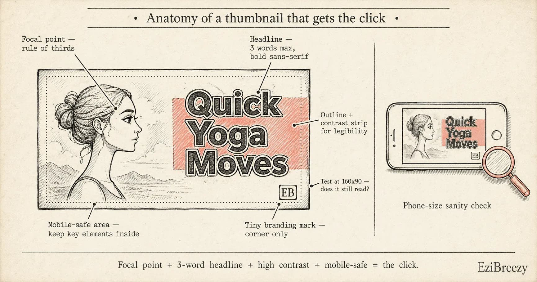
Test your thumbnail at phone size. If the text becomes fuzzy or the image looks unclear when small, you need a bigger font or less text. Trim the message to 2 or 3 words and choose a simpler image so it reads on a 160x90 crop.
YouTube Tag Generator
Find tags that match your video topic to improve discoverability.
Generate YouTube tagsFree - No account required
Master visual hierarchy for immediate impact
Your thumbnail should have a clear focal point that the eye can lock onto in a second. Start with a big, sharp image that communicates the video topic. Then add a short headline in a bold font that sits near the bottom or on the side, so the text and image don't fight for attention.
Use simple alignment rules to guide the viewer. A rule of thirds placement for the main image helps the face or key subject pop. Put the text where it stays legible: near a solid color area or on a dark strip that sits above the image.
Finally, confirm readability at small sizes. View the thumbnail at 100x100 pixels and again at 320x180. If the headline blends into the background or the image loses detail, tweak the contrast or reduce the copy until it stays clear. Pairing your thumbnail work with a strong YouTube title keeps both elements working together.
Color, contrast, and typography that pop
Color and typography are the fast levers for grabbing attention. Use two main colors to keep the design clean and legible in feeds that are full of color. A third accent color helps highlight the key word without clutter.
Choose a bold sans-serif font and limit text to 3 words max. White or yellow text on a dark background reads quickly, and a thin black outline around the letters helps when the image behind is bright.
Add a simple color bar behind the text for extra readability. A semi transparent strip across the bottom makes the words pop without covering the image. Test both a full width bar and a shorter strip to see what reads best on mobile.
Use faces and expressions to boost engagement
Close-up faces read faster
Make eyes the hero
For thumbnails, a clean close-up of a person draws attention faster than a wide shot. Show a clear expression that matches the video mood. For example, a surprised face for a math trick signals curiosity and invites clicks.
Match emotion to topic
Use emotion that aligns with video
If your video teaches a calm routine, use a gentle smile. If you cover a shocking tip, a wide-eyed look signals drama. The match between emotion and topic helps viewers know what to expect.
Avoid clutter in the shot
One person, clear focus
Too many faces or a busy background hides the message. Use a single person or a clear focal point. A simple, clean shot lets the expression show and makes the title readable.
Test, analyze, and iterate for better results
Testing thumbnails helps you learn what works. Start with two versions that differ in one element, like the wording or the image, and keep everything else the same.
Run the test for a full week or until you have enough data. If you reach 1,000 views on that video, you can begin to trust the results. Use the CTR number to pick a winner.
Analyze results and repeat. If the second version beats the first by at least 5–10 percentage points, use that approach for future thumbnails. Document what you learned so you can reuse it later. Combine thumbnail testing with a solid video description to give every upload the best chance.
Thumbnails are small but they make big moves. Start with a simple plan you can repeat: one strong image, two to three words, and a clear contrast.
Keep a small library of options. Save two or three thumbnail versions for each video and compare how they perform over a week. Use what wins to shape your next video.
When you test and learn, you build a bank of designs that work for your channel.
Turn ideas into live thumbnails quickly
Sign up for free at EziBreezy to access thumbnail kits, a grid maker, and more. Use our YouTube tag and description tools to test ideas, then publish on your schedule.
Start planning in EziBreezyRelated YouTube and publishing tools
YouTube Tag Generator
Find tags that match your video topic to improve discoverability.
YouTube Title Checker
Check your title for length, clarity, and keyword use before you lock the thumbnail.
YouTube Description Generator
Create engaging descriptions with keywords to support every upload.
Social Media Character Counter
Tighten hooks, captions, and CTA lines before you publish them.
Better thumbnails. More clicks.
EziBreezy helps you turn strong thumbnails, clear titles, and clean metadata into an organized YouTube publishing workflow.
Start planning in EziBreezy