Your thumbnail is the single biggest factor in whether someone clicks your video or scrolls past it.
YouTube's own data confirms it: click-through rate is the primary signal that determines whether the algorithm shows your video to more people. And click-through rate is almost entirely determined by two things: your title and your thumbnail. Of those two, the thumbnail does the heavier lifting because humans process images 60,000 times faster than text.
The problem is that most thumbnail advice is vague. 'Use bright colors.' 'Add text.' 'Show a face.' That's not a tutorial. This guide covers the exact technical specifications YouTube requires, the design psychology behind thumbnails that consistently outperform, a step-by-step workflow using free tools, and how to use YouTube's native Test & Compare feature to scientifically determine which thumbnails work best for your audience.
You don't need Photoshop. You don't need a design degree. You need the right dimensions, a few proven principles, and a free tool. Let's build a thumbnail.
YouTube thumbnail size and technical requirements
Before you design anything, you need to know the exact specifications YouTube requires. Getting these wrong means your thumbnail gets cropped awkwardly, looks blurry on TV screens, or gets rejected on upload.
The standard YouTube thumbnail size is 1280 x 720 pixels with a 16:9 aspect ratio. The minimum width YouTube accepts is 640 pixels, but always design at 1280 x 720 or higher. If you want maximum sharpness across all devices including smart TVs, design at 1920 x 1080 pixels and let YouTube downscale it.
The maximum file size is 2 MB for most channels, though YouTube has started rolling out a 50 MB limit focused on TV surfaces. Accepted formats are JPG, PNG, GIF, and BMP. For most thumbnails, JPG saved at 85-90% quality gives you the best balance of file size and visual clarity. Use PNG only if your thumbnail has text on solid-color backgrounds where JPG compression would create visible artifacts.
Recommended specs
Use these for every thumbnail
Dimensions: 1280 x 720 px (16:9 aspect ratio). Resolution: 72 DPI minimum, 150 DPI for TV quality. Format: JPG at 85-90% quality. Max file size: 2 MB. Color space: sRGB.
Safe zones to avoid
Elements get covered here
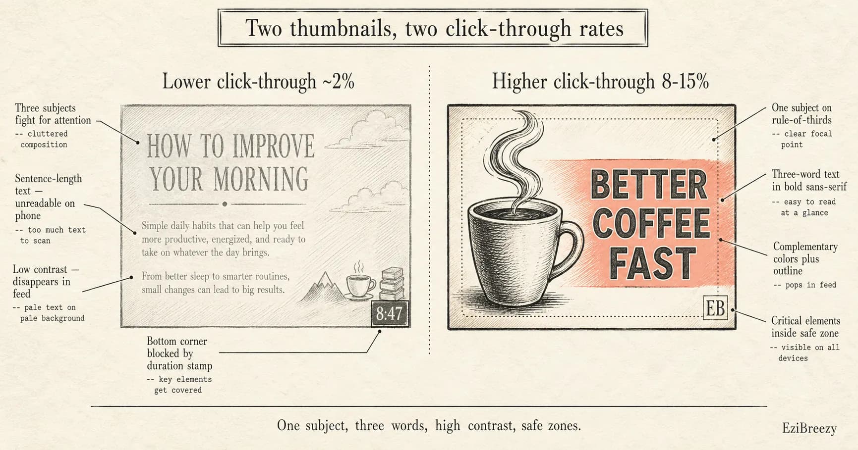
Bottom-right corner: YouTube's video duration stamp covers this area. Bottom-left corner: chapters timestamp can appear here on hover. Keep all critical text and faces within the center 1100 x 620 px area for safe display across desktop, mobile, and TV.
Screenshot Studio
Create polished, professional screenshots and images for your YouTube channel art, social media, and marketing materials.
Try Screenshot Studio freeFree - No account required
The psychology behind thumbnails that get clicked
Viewers decide whether to click your thumbnail in under one second. That's not enough time to read detailed text or analyze a complex image. It's enough time to register an emotion, a question, or a contrast. Every high-performing thumbnail triggers at least one of these three psychological responses.
Curiosity gap: the thumbnail shows enough to make the viewer wonder 'what happens next?' or 'how is that possible?' but not enough to answer the question. A cooking channel showing a perfect cake next to an obviously disastrous attempt creates a curiosity gap. The viewer has to click to find out what went wrong.
Emotional reaction: human faces showing strong emotions (surprise, excitement, confusion, disgust) trigger mirror neurons in the viewer's brain. This is biological. You literally cannot stop yourself from feeling a micro-version of the emotion you see on someone's face. Thumbnails with expressive faces consistently get 30-40% higher CTR than thumbnails without faces.
Pattern interruption: something that looks out of place or unexpected in the context of a YouTube feed. An unusually saturated color palette, an impossible visual, or a stark contrast between two elements. Your thumbnail is competing with dozens of others on the screen. The one that looks different gets noticed first.
6 design principles for high-CTR thumbnails
These aren't opinions. They're patterns extracted from analyzing thumbnails on channels with consistently above-average click-through rates. The average YouTube CTR is 2-10%, depending on niche. Channels that follow these principles regularly hit 8-15%.
How to make a YouTube thumbnail for free (step-by-step)
You don't need expensive software. Canva, Adobe Express, and Pixlr all offer free YouTube thumbnail makers with templates. Here's a step-by-step workflow using Canva, which is the most popular option and has the largest free template library.
Free YouTube thumbnail tools compared
Several free tools can produce professional thumbnails. The right choice depends on whether you prefer templates, AI generation, or manual design control.
Canva
Best overall for most creators
250,000+ templates, drag-and-drop editor, free tier with no watermarks. The Pexels/Pixabay integrations give you access to millions of free stock photos. Background Remover requires Pro ($13/month). Best for: creators who want speed and templates.
Adobe Express
Best for Adobe ecosystem users
Clean interface, strong typography tools, integrates with Creative Cloud. Free plan includes core editing features and thousands of templates. Best for: creators already using Adobe products who want a consistent workflow.
Pixlr
Best for photo editing control
Closer to Photoshop than Canva. Gives you layers, masks, and fine-grained adjustment controls. Steeper learning curve but more powerful for photo manipulation. Best for: creators who want precise control over image editing.
vidIQ Thumbnail Maker
Best AI-powered option
Describe your thumbnail idea in text and vidIQ generates it using AI. Quality is hit-or-miss, but it's fast for brainstorming variations. Pairs well with vidIQ's analytics tools. Best for: quick ideation and creators who already use vidIQ.
How to A/B test thumbnails with YouTube's Test & Compare
YouTube has a built-in A/B testing feature called Test & Compare that lets you upload up to three thumbnail variations and have YouTube determine which one performs best. This is the most underused feature in YouTube Studio, and it's the only way to scientifically know which thumbnail works better rather than guessing.
To use it: open YouTube Studio on desktop, go to your Content library, click the video you want to test, and look for the 'A/B testing' option in the Title box or under Thumbnail. You can test thumbnails only, titles only, or both together. Upload your variations and YouTube will automatically split traffic between them.
Tests typically run for 3 to 14 days depending on how many impressions your video gets. YouTube picks the winner based on watch time share (not just CTR), which means the winning thumbnail is the one that attracts viewers who actually watch your video, not just click and bounce.
Common thumbnail mistakes that kill your CTR
Knowing what not to do is just as important as knowing the best practices. These are the most frequent mistakes that keep thumbnails from performing, even when the underlying video is good.
Building a thumbnail workflow that scales
Creating thumbnails one at a time from scratch is slow. Once you've found a style that works for your channel, build a reusable system.
Create 2-3 thumbnail templates in Canva with your brand fonts, colors, and layout structure already in place. For each new video, duplicate a template and swap the image and text. This takes 5-10 minutes instead of 30-45 minutes designing from scratch.
Batch your thumbnail creation. When you film multiple videos in one session, take dedicated thumbnail photos at the same time. Set up proper lighting, make your expressions, and shoot 10-20 variations for each video. Having purpose-shot thumbnail photos to work with is dramatically faster and better looking than pulling frames from video footage.
Keep a swipe file of thumbnails that make you click. When you see a thumbnail in your feed that grabs your attention, screenshot it. After a month, review your collection and identify the patterns: which colors, compositions, and styles consistently caught your eye. Apply those patterns to your own thumbnails.
A great thumbnail doesn't save a bad video, but a bad thumbnail absolutely kills a great one. The difference between a 3% CTR and an 8% CTR can mean tens of thousands of additional views on a single video, compounding across your entire library.
Start with the fundamentals: correct dimensions, one clear subject, high contrast, and minimal text. Use a free tool like Canva to build your first few thumbnails. Then use YouTube's Test & Compare to let the data tell you what works for your specific audience. Once your thumbnails are dialed in and your content is ready, consistent publishing is what builds the momentum. Scheduling your uploads in advance keeps you on a regular cadence without having to remember to publish manually.
Related tools
Thumbnails ready. Schedule the upload.
Once your thumbnails and videos are ready, ezibreezy lets you schedule YouTube uploads in advance so your content goes live at the perfect time, every time, without you watching the clock.
Start planning in EziBreezy